Introduction
In the fast-paced world of food manufacturing, precision and productivity go hand-in-hand with safety and quality. The MiWeigh Dashboard's Operator Performance feature is a cornerstone of efficiency for professionals in the food industry. This feature allows managers and supervisors to gain real-time insights into the productivity and precision of their operations, making it easier to align performance metrics with organisational goals. By addressing common challenges such as uneven workloads or inefficiencies in operator performance, it helps streamline processes while maintaining safety and quality standards. This guide delves into how the Operator Performance feature integrates seamlessly with your workflow, using data to improve both speed and precision.
Exploring the Dashboard
The Operator Performance feature introduces new tools to help you monitor and optimise your operations:
Time Period: Select a desired data range for your operations.
Top Operators: View which operators perform best within the selected date range.
Efficiency Heat Map: Identify your best-performing days over a 30-day period.
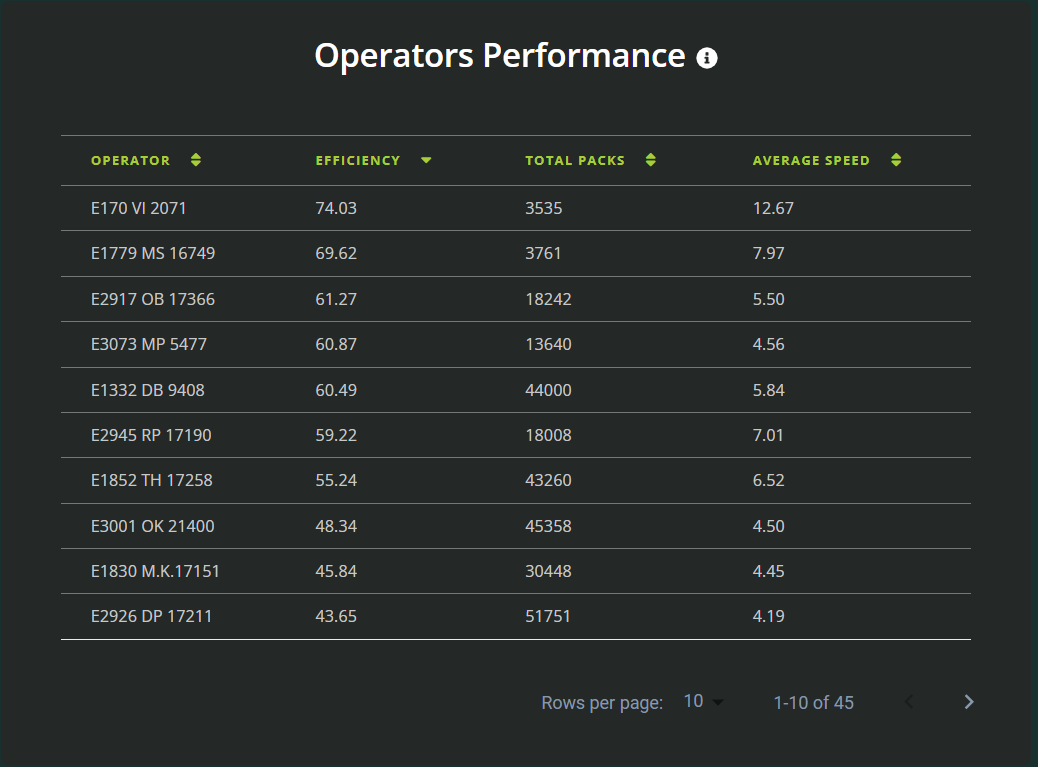
Operator Performance: Gain a detailed overview of each operator’s performance.
Step-by-Step Guide
Accessing the Operator Performance Feature
From the dashboard homepage, click on the "Operator Performance" link to navigate to the feature. This section is designed for intuitive use, ensuring you can quickly find the data you need.
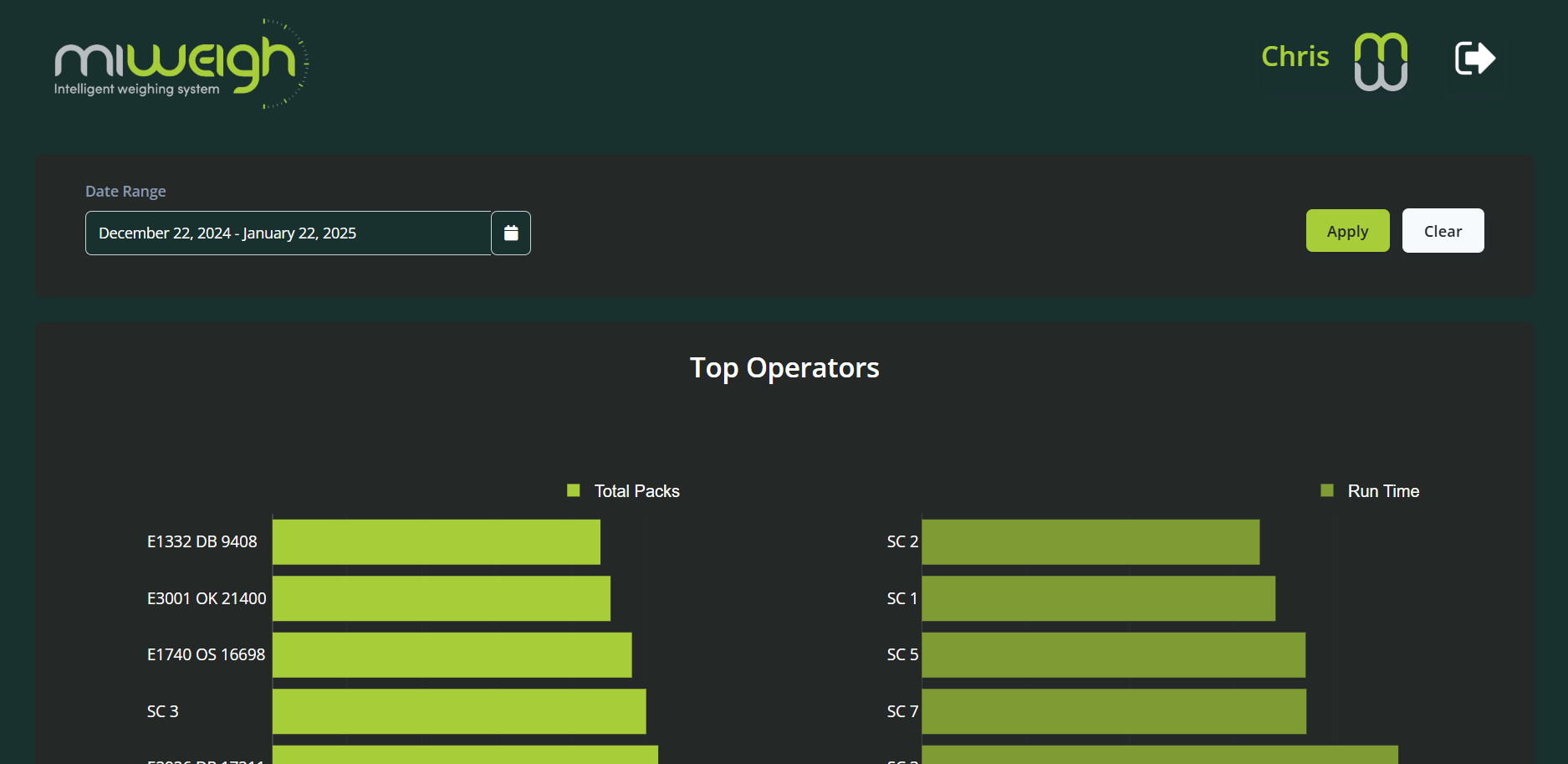
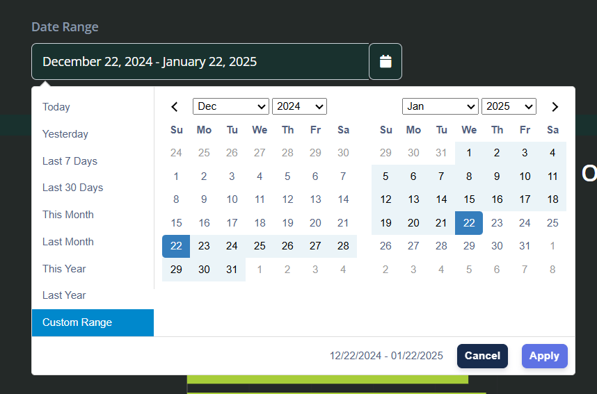
Selecting a Time Period
Begin by selecting the time period you wish to review. You can:
Use pre-selected date ranges on the left-hand side.
Choose a custom range for specific operational insights.
By default, the dashboard displays data from the previous 30 days.
Once the range is selected, click "Apply" to update the data.
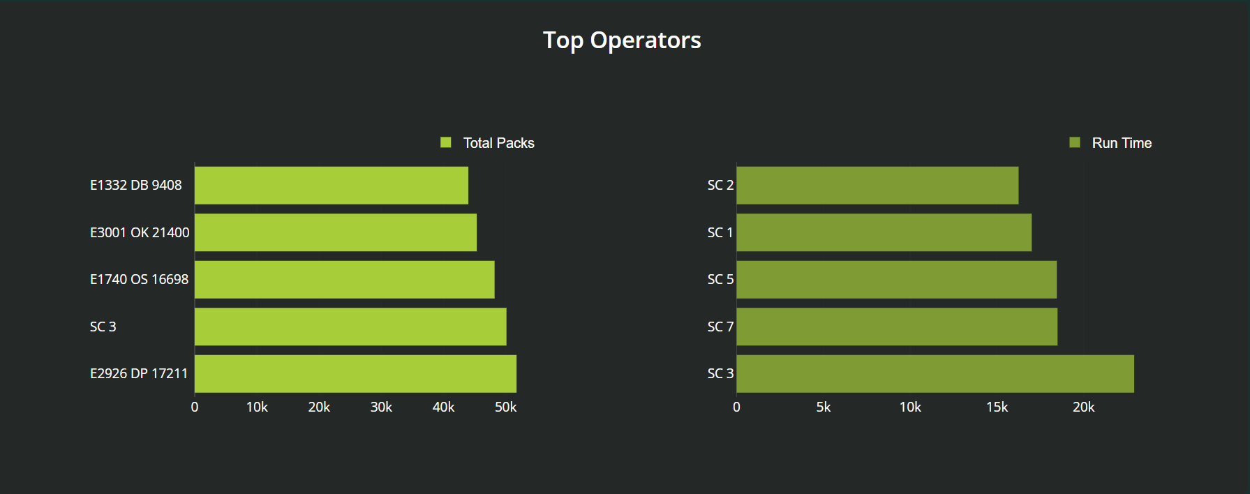
Top Operators
At the top of the page, bar charts highlight the top-performing operators. These charts show performance metrics such as:
Number of packs weighed.
Total run time. This data helps you identify and celebrate high-performing operators, fostering a culture of recognition and motivation. For example, by consistently monitoring these metrics, organisations can implement reward systems or provide targeted training for operators who may need additional support to reach their potential.
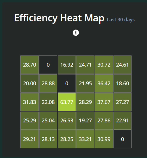
Efficiency Heat Map
Below the bar charts, you’ll find the efficiency heat map, a dynamic visual tool that simplifies complex data into intuitive colour gradients. These gradients represent varying levels of operational productivity, with lighter shades indicating lower efficiency and darker shades highlighting peak performance. This heat map enables managers to quickly identify patterns, such as days or shifts with exceptional productivity, or pinpoint periods requiring closer scrutiny. This visual tool uses colour gradients to depict productivity levels across workflows, personnel, or sectors. Each hue represents a different level of daily efficiency, enabling you to:
Quickly grasp performance metrics.
Hover over values to explore detailed data for specific days.
Click on a value to load that day’s data for in-depth analysis.
Operator Performance Data
As you scroll down, individual operator performance data becomes visible. This section offers:
Computed efficiencies that account for multiple variables beyond just pack counts and speed, such as error rates, downtime, and consistency of performance. These insights allow for a comprehensive evaluation of operator effectiveness, giving managers a clearer understanding of factors influencing overall productivity.
A sortable list of operators. Click column headers to organise data from lowest to highest values, tailoring your analysis to your specific needs.
Benefits of the Operator Performance Feature
The Operator Performance feature empowers food industry professionals by providing:
Actionable Insights: Monitor trends, identify top performers, and spot opportunities for improvement.
Customisable Data Views: Filter and sort data to focus on the metrics most relevant to your operations.
Enhanced Productivity: Use detailed performance analytics to optimise workflows and boost efficiency by identifying bottlenecks, reallocating resources effectively, and implementing targeted improvements. For example, analysing peak performance times can help schedule operations during optimal periods, while understanding low-performance zones can guide better resource planning and training.
Conclusion
The MiWeigh Dashboard’s Operator Performance feature is a game-changer for operational analysis and decision-making. Its intuitive design and cutting-edge tools help you stay ahead in the competitive food manufacturing industry. By leveraging these features, you can refine your processes, celebrate successes, and foster a culture of continuous improvement. Stay tuned for more updates as we continue to innovate and enhance your experience with the MiWeigh Dashboard.
Was this article helpful?
That’s Great!
Thank you for your feedback
Sorry! We couldn't be helpful
Thank you for your feedback
Feedback sent
We appreciate your effort and will try to fix the article