Welcome to the MiAssist Dashboard! This guide is designed to help you fully understand and utilise the dashboard to monitor your machines effectively and make data-driven decisions to optimise your production.
TABLE OF CONTENTS
- Accessing the MiAssist Dashboard
- Dashboard Layout and Functionality
- Offline
- Production Data Section
- MiAssist Dashboard & Production Data Summary
- Frequently Asked Questions (FAQ) — MiAssist Dashboard & Production Data
Accessing the MiAssist Dashboard
Start at the MiAssist Home Page:
Upon logging in, you will see the home page interface. To monitor your machines, locate and click on the MiAssist Dashboard button.
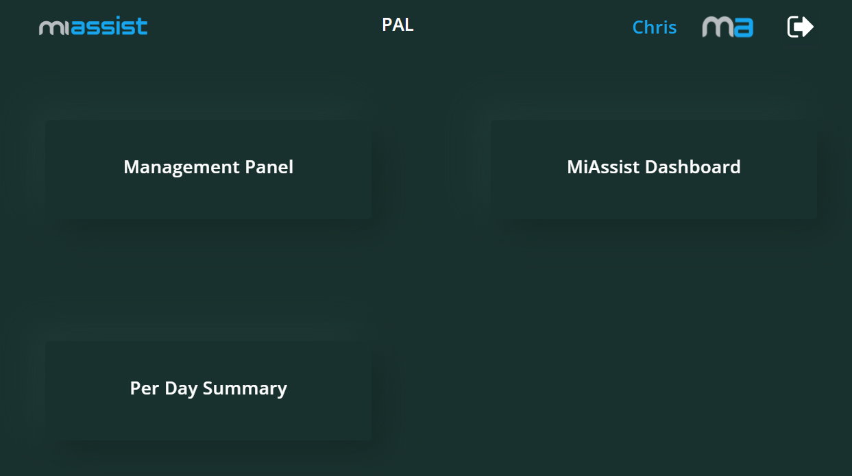
Load the Dashboard:
Clicking this will take you to the MiAssist Dashboard page, where all your onboarded machines’ status and performance metrics are displayed in real-time or near real-time.
Dashboard Layout and Functionality
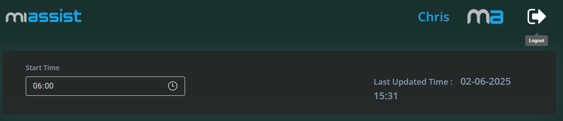
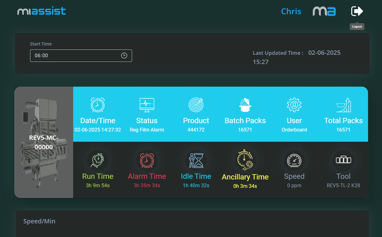
Start Time Drop-down:
This drop-down menu lets you select the starting point of the data timeframe you want to review. For example, you may want to analyse machine performance from the start of the current shift, day, or a custom time range. By selecting a start time, you filter out older data, focusing on the period relevant to your current operational needs.
Selecting a specific timeframe allows you to track performance trends, troubleshoot recent issues, or analyse the impact of changes made during a particular shift or day.
Last Updated Time:
Next to the start time filter, you will see a timestamp indicating when the dashboard data was last refreshed. This helps you confirm that you are looking at the latest available machine data.
Ensuring you have up-to-date information is critical for timely decision-making, especially when monitoring machine faults or production speed.
Below the filters, the dashboard displays a comprehensive list of all machines currently onboarded to the MiAssist system. Each machine entry gives you an at-a-glance summary of its current and recent status.
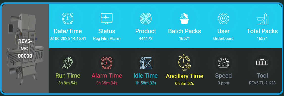
Machine Image and Machine Number:
Each machine is represented with a small image (e.g. a photo or icon) alongside its unique machine number. This visual aid helps you quickly identify each machine without confusion, especially in environments with many similar units.
Use the image and number to ensure you’re looking at the correct machine when cross-referencing with the physical machine or maintenance records.
Status Information
The status information for each machine is divided into two rows, each displaying key metrics:

Date and Time:
This timestamp shows the most recent data capture for the machine’s status. It lets you know exactly when these readings were taken.
It helps you understand how current the information is and assess if the machine status has recently changed.
Status (Stopped/Running):
Indicates whether the machine is currently active (running) or inactive (stopped).
Monitoring machine status helps in identifying downtime immediately. If a machine unexpectedly stops, you can investigate quickly to minimise production loss.
Product (Batch Run Count):
Displays which product the machine is currently running.
Batch Packs:
The number of packs produced in the current batch.
Helps measure progress within a batch and estimate when the batch will complete.
User (Onboarded):
Shows the name or ID of the user who onboarded or is responsible for this machine.
This is useful for accountability and to know who to contact if issues arise.
Total Packs:
The cumulative number of packs produced by the machine over the monitored timeframe or session.
Useful for tracking overall machine output and productivity.
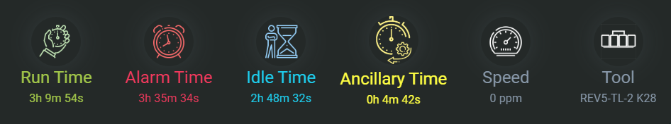
Run Time:
The total amount of time the machine has been running during the selected period.
Run time reflects machine utilisation. Higher run time often correlates with higher productivity.
Alarm Time:
The time the machine has spent in alarm or fault conditions.
Frequent or prolonged alarm time indicates potential mechanical or operational issues needing attention to avoid downtime.
Idle Time:
Time when the machine was powered on but not actively running or producing.
High idle times might suggest inefficiencies or bottlenecks elsewhere in the production line.
Ancillary Time:
Time spent on auxiliary activities such as setup, maintenance, or cleaning that are not directly related to running the main production process.
Understanding this can help improve scheduling and reduce overall downtime.
Speed:
The current operating speed of the machine, usually expressed in units like packs per minute (PPM) or lines per minute (LPM).
Speed impacts production throughput. Tracking speed helps ensure machines are running at optimal rates.
Tool Loaded:
Identifies which tool or configuration is currently loaded on the machine.
Ensures that the correct tooling is in place for the specific product or batch, avoiding errors and quality issues.
Speed Line Graph (Below the Machines List)
At the bottom of the dashboard, a line graph visually represents machine speed over time.
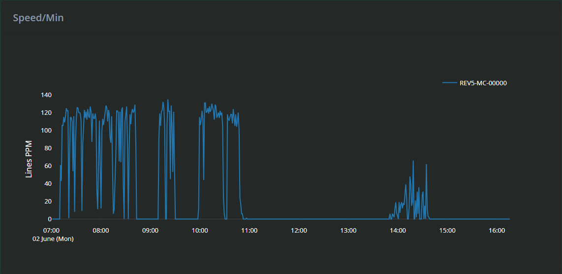
What it shows:
The graph plots Lines Per Minute (PPM) on the vertical axis against time on the horizontal axis, giving a visual overview of how the machine’s speed changes over the selected timeframe.
Interacting with the graph:
Zoom In: Click and drag your mouse over a portion of the graph to zoom in and inspect detailed speed fluctuations during that period.
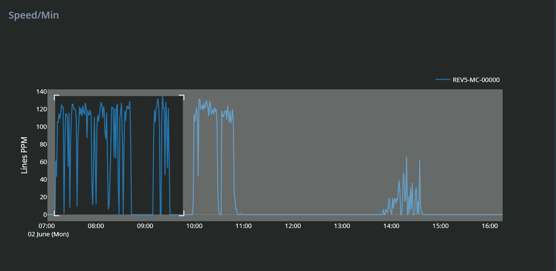
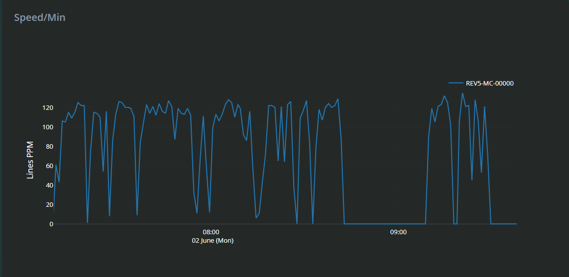
Reset Zoom: Double-click anywhere on the graph to return to the default full-view timeline.
The speed graph helps identify trends, such as periods of slowdown, speed spikes, or consistent speed drops that might indicate mechanical wear or operator issues. Zooming in allows detailed inspection of specific timeframes, useful for correlating speed changes with alarms or idle times.
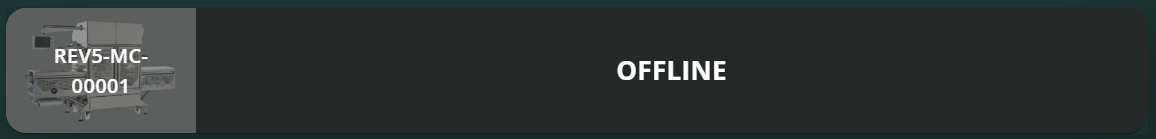
Offline
If the machine had been powered down or is not connected to MiAssist you will see the machine status in the dashboard as offline.
Production Data Section
When you click on any machine in the MiAssist Dashboard, you will be directed to a dedicated Production Data page for that specific machine. This page provides a more detailed and flexible view of production information, allowing you to drill down into specific metrics and customise the data you want to see.
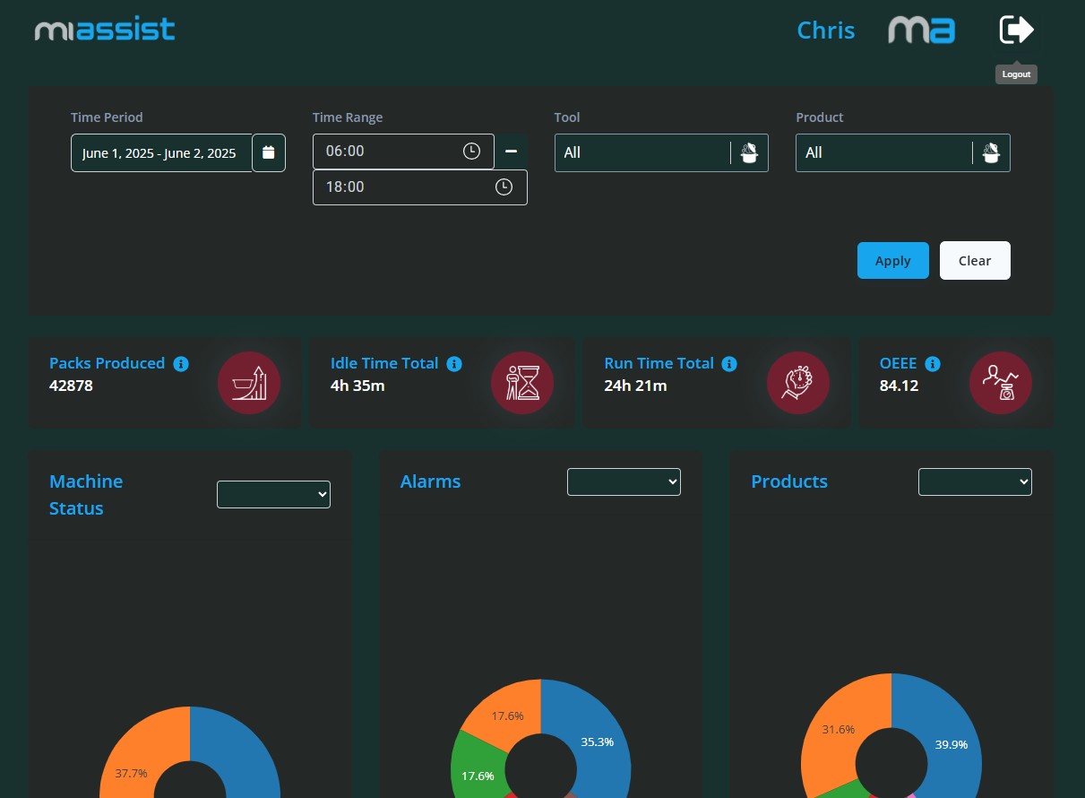
Filter Section (Top of the Page)
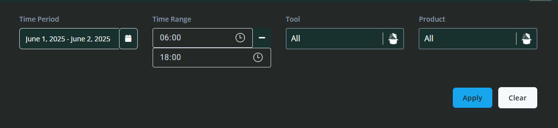
At the top of the Production Data page, you will find a set of filters designed to help you narrow down the data displayed:
Time Period: Select the overall time period you wish to review (e.g. last day, week, month).
Time Range: Allows for a more specific time range within the selected period.
Tool: Filter the data by the specific tool currently loaded or used on the machine.
Product: Filter data by the product or batch being processed.
Once you have set your filter preferences, you can click Apply to refresh the data displayed or Clear to reset the filters to default.
Filters give you control over the scope of data viewed, enabling targeted analysis for specific shifts, tools, products, or timeframes. This can help identify patterns or issues related to particular conditions or products.
Summary Production Data

Directly below the filters, you will see key production metrics presented clearly:
Packs Produced: Total number of packs produced within the selected time frame.
Idle Time Total: Total time the machine was idle during the selected period.
Run Time Total: Total time the machine was actively running.
OEEE (Overall Equipment Effectiveness Estimate): This metric reflects the ratio of run time to idle time, indicating machine efficiency. A higher OEEE means the machine was productive for a greater proportion of the time.
These figures provide an immediate snapshot of machine productivity and utilisation. Monitoring OEEE helps highlight inefficiencies and opportunities to improve machine uptime.
Pie Charts for Visual Overview
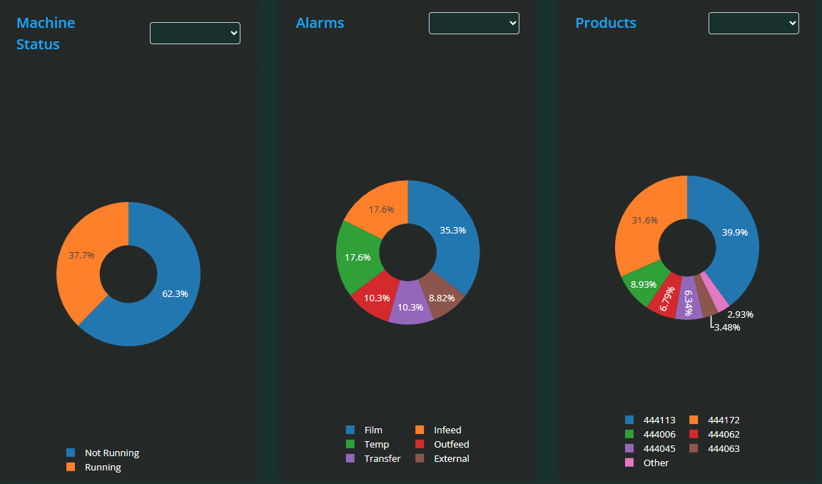
Below the summary data, there are three interactive pie charts displaying the following:
Machine Status: Breakdown of time the machine spent in various states (e.g. running, stopped, idle).
Alarms: Distribution of different alarm types or frequencies.
Products: Proportion of different products processed during the time frame.
Each pie chart includes its own drop-down filter, allowing you to focus on specific statuses, alarm types, or products.
These visualisations provide an easy way to understand how time and events are distributed, helping quickly identify dominant machine states, frequent alarms, or product mixes that may require attention.
Packs Per Day Line Graph
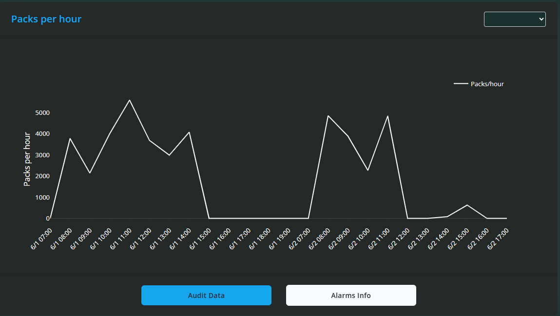
Below the pie charts is a line graph showing Packs Produced Per Day over the selected time period. This graph helps visualise production trends over time.
You can zoom in on specific date ranges by clicking and dragging over the graph.
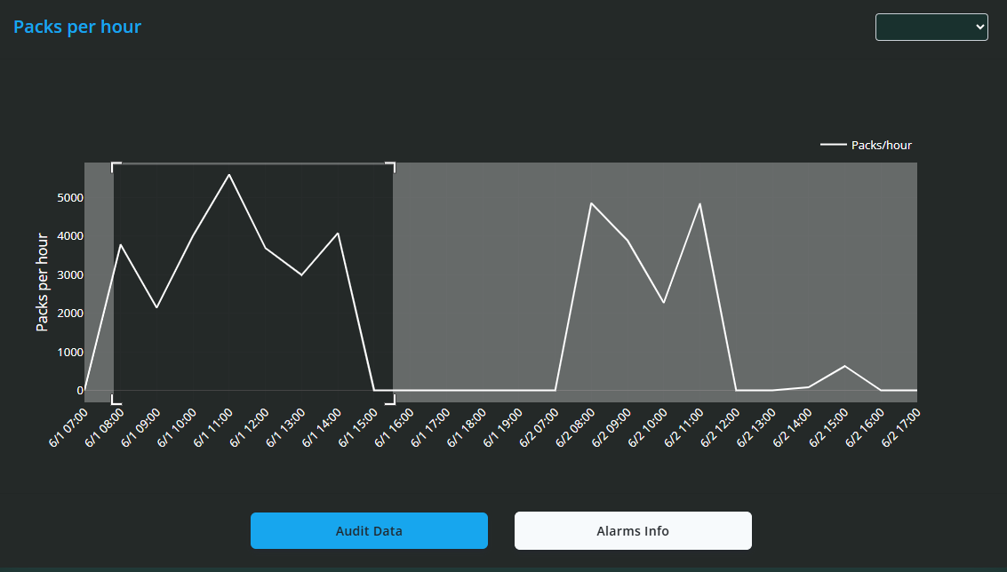
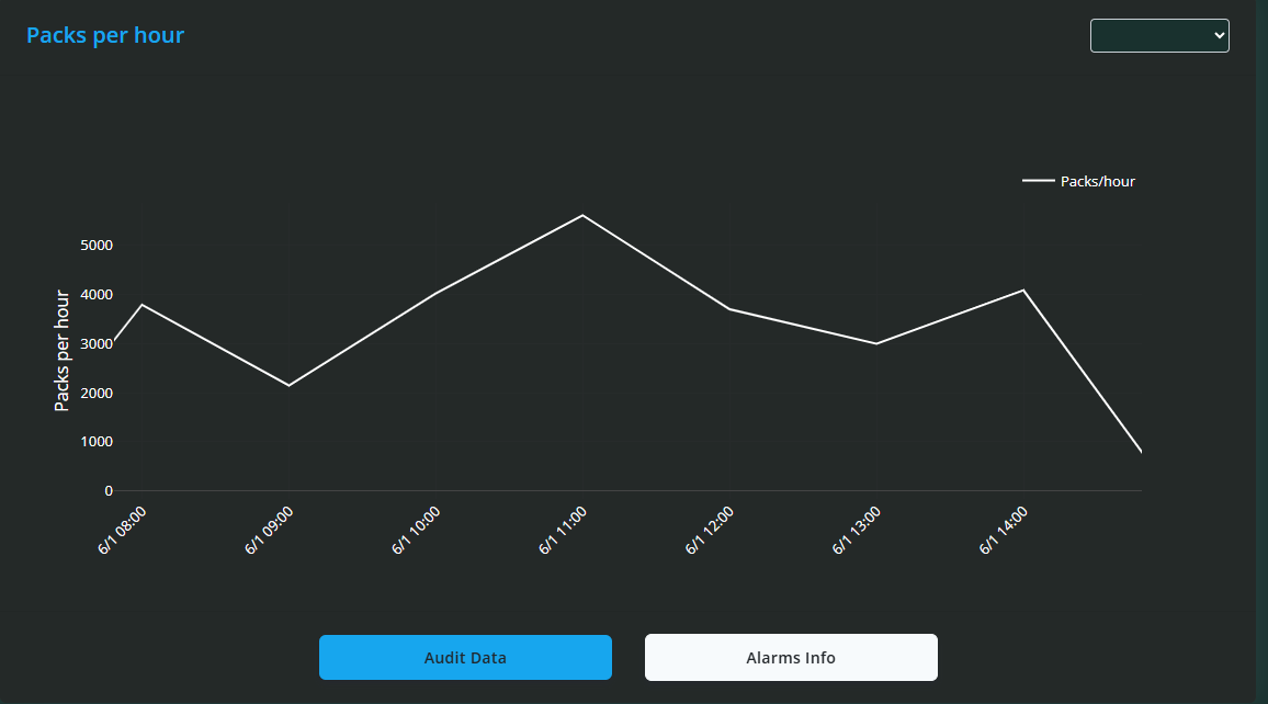
Double-clicking resets the view to show the entire data range.
Two buttons are located beneath the graph:
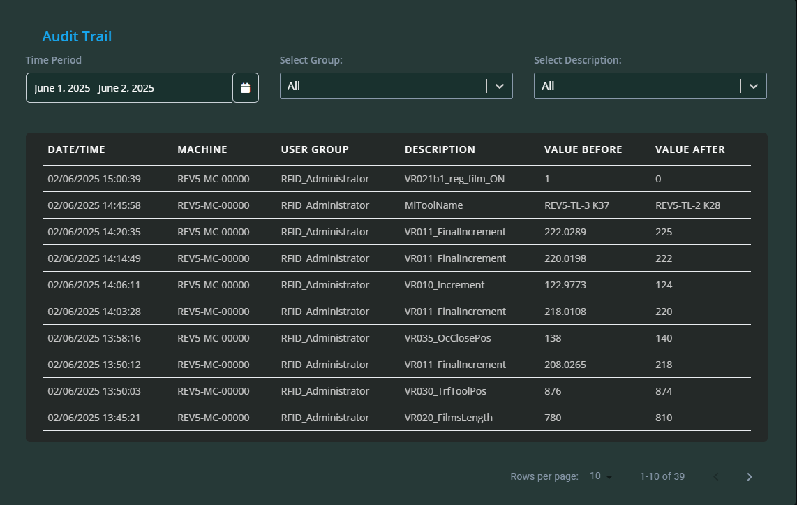
Audit Data: Clicking this displays a detailed log of all changes made to the machine. Each log entry includes the date/time, machine, user group responsible, a description of the change, and the values before and after the modification.
Alarms Info: Clicking this shows a log of all alarms that have occurred for the machine, with details including date/time, machine, group, and description of each alarm.
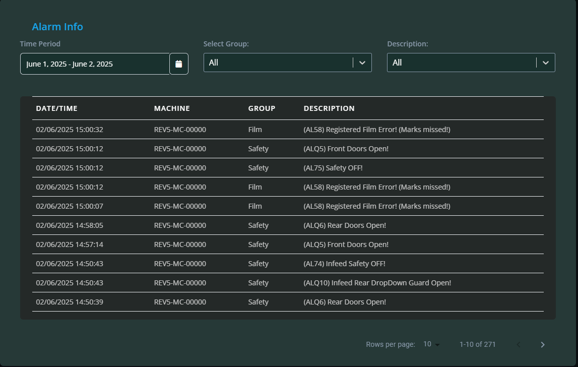
At the top of these log views, filters are available so you can refine the displayed data by date, machine, or other criteria.
Machine State Distribution Bar Chart
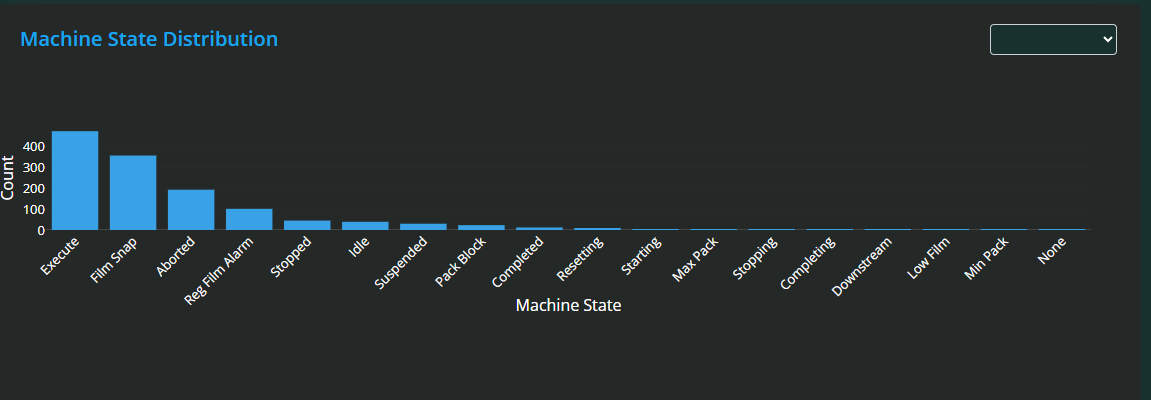
At the bottom of the page, you will find a Machine State Distribution bar chart. This chart illustrates the total time spent in each machine state over the selected period.
Similar to the line graph, you can zoom in by dragging over the chart and reset the zoom with a double-click.
This bar chart provides a clear visual summary of how machine time is allocated across different states, helping identify where the machine spends most time and where improvements might be made.
MiAssist Dashboard & Production Data Summary
The MiAssist Dashboard provides a centralised, real-time overview of all your onboarded machines, offering detailed operational insights to help you monitor performance, detect issues early, and optimise production efficiency.
From the MiAssist Home Page, access the Dashboard to view key machine data. At the top, the filter section allows you to select specific start times to focus your analysis on relevant periods, while the last updated timestamp ensures you are viewing the most recent information.
The machines list displays essential information for each machine, including an identifying image and machine number, current status (running or stopped), production details such as batch counts and total packs, as well as operational metrics like run time, alarm time, idle time, ancillary time, speed, and the tool loaded. This layered data helps you track productivity, diagnose downtime, and ensure correct tooling and batch processing.
Beneath the machines list, an interactive speed line graph plots packs per minute over time, enabling you to zoom into periods of interest or revert to the full view with ease. This graph aids in recognising speed fluctuations that may indicate mechanical or operational concerns.
Clicking on a specific machine directs you to the Production Data page, offering a deeper dive into that machine’s performance. Here, filters for time period, time range, tool, and product provide granular control over the data displayed. Key production metrics such as total packs produced, idle and run time totals, and the Overall Equipment Effectiveness Estimate (OEEE) summarise machine productivity and efficiency.
Three interactive pie charts offer visual breakdowns of machine status, alarms, and product distribution, each with individual filters to tailor your analysis. Below these, a line graph charts daily pack production with zoom capabilities, accompanied by Audit Data and Alarms Info logs that track machine changes and alarm events respectively, both with filter options for focused review.
Finally, a bar chart illustrates machine state distribution over the selected period, helping you quickly assess where the machine spends most of its time. Like other charts, it supports zooming for detailed examination.
Together, these tools empower you to comprehensively monitor machine health and production, identify inefficiencies, and make informed decisions to enhance operational performance and minimise downtime.
Frequently Asked Questions (FAQ) — MiAssist Dashboard & Production Data
1. How often is the data on the dashboard updated?
Data is refreshed in near real-time to provide you with the most current machine status and production information. The exact update frequency is displayed in the “Last Updated Time” at the top of the dashboard.
2. What does OEEE mean and how is it calculated?
OEEE stands for Overall Equipment Effectiveness Estimate. It reflects the proportion of time the machine was actively running compared to idle time. A higher OEEE indicates better utilisation and efficiency of the machine.
3. What do the different machine statuses indicate?
Running: The machine is actively producing.
Stopped: The machine is not operating.
Idle: The machine is powered on but not running.
Alarm: The machine has encountered an error or fault requiring attention.
4. How can I reset filters or zoom on the graphs?
To reset filters, simply click the Clear button in the filter section.
To reset zoom on any graph, double-click anywhere on the graph to return to the full data view.
5. Can I export or download the data from the dashboard?
Currently, data export or download functionality is not available directly from the dashboard. For specific data requests, please contact the MiAssist support team.
6. What should I do if I notice frequent alarms on a machine?
Frequent alarms could indicate underlying mechanical or operational issues. Review the alarm log on the Production Data page for details, and escalate the issue to your maintenance team or MiAssist support for troubleshooting.
7. What is the purpose of the Audit Data log?
The Audit Data log records all changes made to the machine settings, including who made the change, when, and what values were adjusted. This provides accountability and helps track configuration changes.
8. Can I filter the data shown on the Production Data page?
Yes, you can filter by time period, time range, tool, and product using the filters at the top of the page. Apply the filters to refresh the data view accordingly.
9. How do I interpret the pie charts and bar charts?
Pie Charts: Show the distribution of machine status, alarms, and products within the selected timeframe.
Bar Chart: Displays the total time spent in different machine states, helping identify where the machine spends most of its operating time.
Was this article helpful?
That’s Great!
Thank you for your feedback
Sorry! We couldn't be helpful
Thank you for your feedback
Feedback sent
We appreciate your effort and will try to fix the article